- Best Shadow & Highlight Techniques
In this tutorial, we will explore how to avoid or remove artifacts. Then I will propose a single tool that is effective for brightening shadows, controlling highlights, and creating dramatic effects.
This image is a real challenge (thanks to its author): usually we struggle with highlights, but here there are both highlights and, above all, very (very) dark shadows, with values close to, or even at, zero.
Beyond the aesthetic aspect of the result, there is above all a technical challenge in terms of methods.
I deliberately chose extreme settings to show that even with a ‘degraded’ starting image it is possible to obtain a more than acceptable result; for example the “Contrast Enhancement” values are huge.
Image selection
This image was shared by Thumper on the pixls.us forum. Thumper generously licensed his work under the Creative Commons, By-Attribution, Share-Alike license.
I also include two RawTherapee pp3 sidecar files that we will use below:
- pp3 file 1: First example with Color Propagation
- pp3 file 2: Second example with Color Propagation and blur
Image : neutral
Here is a screenshot of the image in neutral mode with Lockable Color Pickers. You can immediately see that the photographer has underexposed
the overall frame to avoid overexposing the sunset sky. Despite this
choice, potential artifacts are already appearing in the area of the sky
near the power pole. See also the histogram in ’linear’ mode.
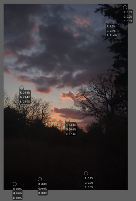
Image - neutral
Things to note:
- The Raw histogram is not ‘abnormal’, but there are very few values outside the shadows. The blue channel is dominant.
- The Metadata: the camera used is a recent 24x36 camera - Canon EOS R6 with a good quality 50mm f/1.8 lens, open to 2.8. ISO = 100. Shooting in ‘auto’ mode.
- The data is in the ‘black’ part of the image. There are two groups (peaks on the histogram): values with R=0.4%, G=0.4%, and B=0.4%, and others with R=0%, B=0%, and G=0%. In Lab mode, there are values with L=0, a=1, and b=-4 (which is theoretically impossible).
- As soon as we want to edit something, we see (with the help of the
histogram, the soft proofing, and of course, the examination of the
image), artifacts appearing:
- In the deep shadows, numerous ‘green dots’ appear (make sure you have
turned on

Soft-proofingand
Highlight pixels with out of gamut colorson the bottom of the editor panel to see this). - The area near sunset is dotted with artifacts of several types.
- The transition zones in the sky, between the reddish clouds and the clear blue sky, show very poor transitions.
- In the deep shadows, numerous ‘green dots’ appear (make sure you have
turned on
- If the author has access to Dark Frame or Flat field reference images they could be used to correct some of these problems. For this exercise we will assume they aren’t available.
Learning objective
The user will understand the ‘Game changer’ approach discussed in this tutorial:
- The role of
RawTab tools, in particular to combat artifacts. - The importance of
Color Propagation, including in (very) deep shadows. - The importance of Gamut Compression.
- White Balance optimization - Temperature correlation.
- The role of
Graduated Filter. - The importance and settings of
Abstract Profile- with a reasoned use of primaries, and the use of very high local contrast to enhance the dramatic effect (Note that the halos are barely visible, even with these unusual settings). - The combined use of
Selective Editing>Generalized Hyperbolic Stretch(GHS) &Michaelis-Menten(MM) and 2Excluding Spots. - The use of
Color Appearance & Lightingand the possible corrections of the 3 channels R, G, B.
I will present two possible processing methods using two pp3 files. I will
describe the first; the reader can discover the second for themselves. The
essential difference lies in the Color Propagation and Raw Black Points
settings.
I’ve separated the tools as they appear in the interface, but it would be
more accurate to refer to them as Raw processes. From my perspective, tools
like Color Propagation, which is activated immediately after assigning
the Working Profile, and White balance Temperature correlation, which
is activated immediately after demosaicing, fall under the Raw category.
Do not attempt to reduce noise, whether using in Capture Sharpening,
Presharpening denoise, Post-sharpening denoise, or Noise reduction
(Detail tab); you will only degrade the image. The only option, if desired,
is to add an additional RT-Spot to the sky (or part of the sky) using
Selective Editing > Blur/Grain & Denoise > Denoise.
Raw tools
Find these tools under the
 raw tab on the
toolbar.
raw tab on the
toolbar.
Demosaicing
- The choice of
Amaze+VNG4allows for good detail rendering of structures and a possible reduction of artifacts in flat areas. - False color suppresion steps: setting it to 4 slightly reduces artifacts
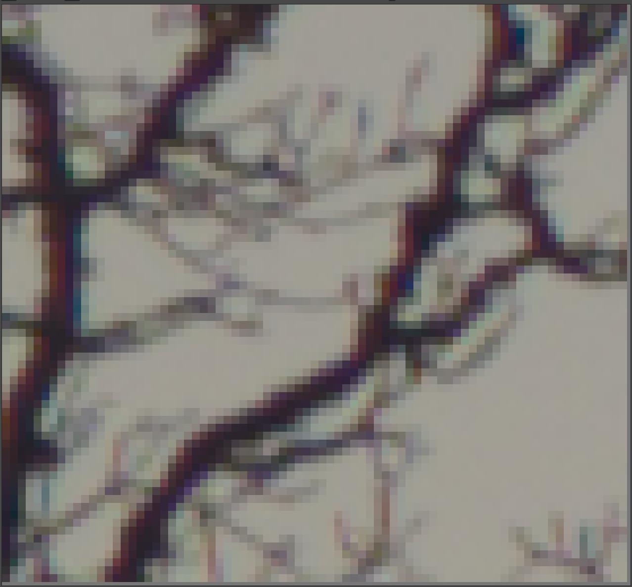
AMaZE+VNG4 demosaicing, without false colour suppression; notice the blue and red speckling on the branches.
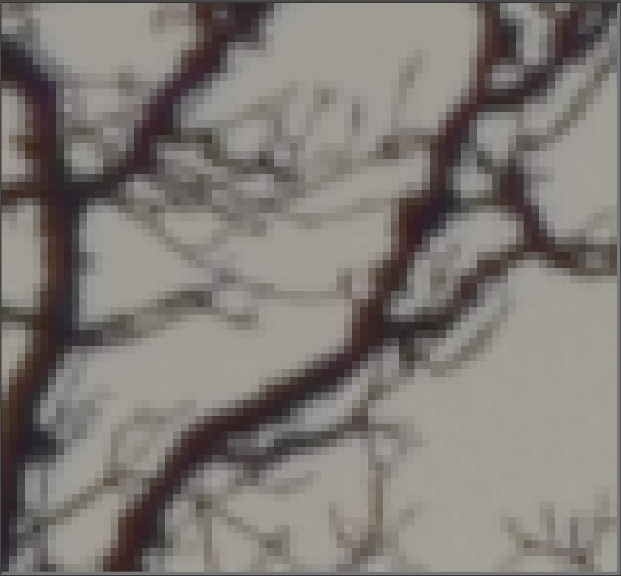
AMaZE+VNG4 demosaicing, false colour suppression = 4; the coloured speckling is eliminated.
More on demosaicing
Raw Black Points
The Dehaze system designed by Ingo Weirich (thanks to him) suggests here,
due to the difference between the values R=0, G=0, B=0 and the very low
values R=0.4%, G=0.4%, B=0.4%, that it’s a haze problem. I think that’s not
the case – we’re dealing with shadow detail lost due to the image being
underexposed, the same way we lose highlight detail when an image is
overexposed.
- First, try the “Dehaze” checkbox; you’ll see the sliders move to the right, the histogram expands, especially to the left (the shadow areas), and the image is brighter and more colorful: Red:+1, Green 1:+7, Green 2:+7, Blue:+2.
- Second, increase the settings (by unchecking the ‘Dehaze’ box) : Red:+3, Green 1:+14, Green 2:+8, Blue:+5. You will again notice a more vivid image, a better utilized histogram, and a reduction in artifacts.
More on Raw Black Points
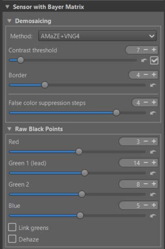
Demosaicing & Raw Black Points
Below, you can see the influence of Raw Black Points on the image at the end of the process (i.e., after all the processing steps below have been completed). This histogram corresponds to the pp3 file 2 : ‘Second example with Color Propagation and blur’ at the end of the process, with the histogram type set to ‘Output profile mode with a gamma.’
- Note the difference on the horizontal axis, close to zero.
- Note that the overall histogram is better filled.
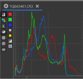
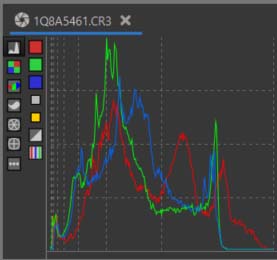
- Be very careful, these settings are very sensitive and can contribute to making the images unusable.
Chromatic Aberration Correction
- We can reduce some minor artifacts caused by Chromatic Aberration by
manually adjusting the red and blue channels. (Note that we’re using the
Chromatic Aberration Correctiontool in theRawtab here, not the tool with the same name in theTransformtab.)
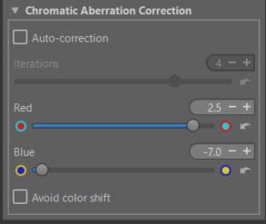
More on Chromatic Aberration.
Preprocess White Balance
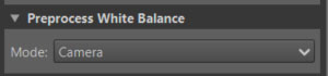
I chose “Camera” which seems to produce a better result. During the Raw pre-processing, when nothing is determined, it’s necessary to choose a temperature to quantify the data. This is either the ‘Camera’ value present in the Exif, or a rough calculation done with ‘Automatic RGB Grey’.
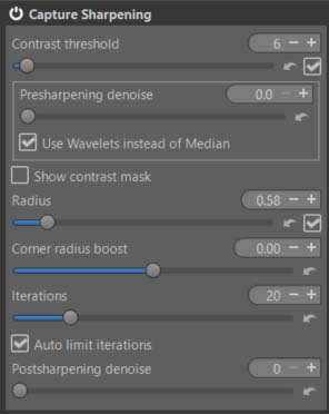
Capture Sharpening
- Activating Capture Sharpening works without any problems. The contrast threshold is not set to zero. It will recover details lost due to in-camera blurring.
More on Capture Sharpening
Color Propagation
- Observing the reaction of the modules mentioned in the recommendations, the contribution of “Color Propagation” is small on the ’numbers’, but not negligible. On the other hand, and this is its initial role, it allows the recovery of ’lost’ data in highlight, but also in very deep shadow.
- If you try another tool in ‘Highlight reconstruction’, such as ‘Inpaint opposed’ you will see that it has no effect on very deep shadow.
- The first example is without the ‘Blur’ slider in ‘Color Propagation’ being activated. This slider allows you to adjust the transitions between ‘recovered’ (and therefore lost) areas and healthy areas. This also led to a change in the ‘Raw Black Points’ setting.
White Balance - Temperature correlation
To fully utilize the capabilities of White Balance Auto temperature correlation, you can activate the corresponding checkbox in Preferences > Color Management
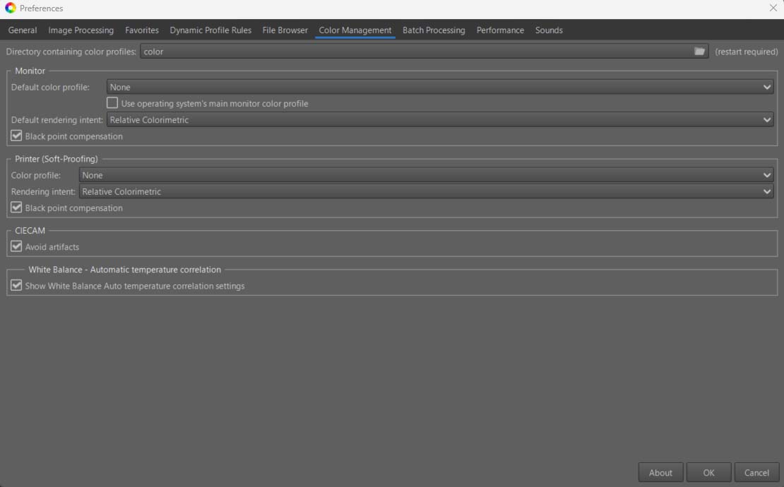
- Once this choice is made, you can select
Close to full CIE diagram, because clearly with this sky we are beyond the reflected colors and the default selectionMedium sampling - near Pointers's Gamut. - You can also check
Remove 2 pass algorithmswhich seems to give a slightly more ‘dramatic’ result (but that’s a matter of perspective). - You could also, but it doesn’t seem necessary here, use
Green refinementwhich can in some cases compensate for the algorithm’s shortcomings.
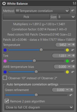
- The automatic calculation always performs two passes: the first with the
base results, and a second to try to get closer to D50, thus avoiding
color adaptation (which can be done in
Automatic Symmetricmode using Color Appearance & Lighting). The choice is up to the user. Among the criteria is theCorrelation factor; the smaller it is, the better. The other criterion is theSize, which is the number of colors found to be significant for comparison with the reference spectral colors (approximately 400). The larger theSize, the better. Note that it may be affected by chromatic noise.
Gamut Compression
As a reminder, this algorithm does not perform a “conversion” but
compresses the data to the output profile (in linear mode, without gamma).
It will ensure, at a minima, that the data will be within the gamut.
Hence the importance of examining the histogram in mode gamma-corrected
output profile
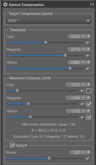
- I made a few small changes to the default settings, but you can try
modifying all 3
Thresholdvalues as well asRolloff & Power.
Selective Editing - Five RT-Spots
The first - Equalization & Pre-Tone Mapping - Michaelis-Menten (MM)
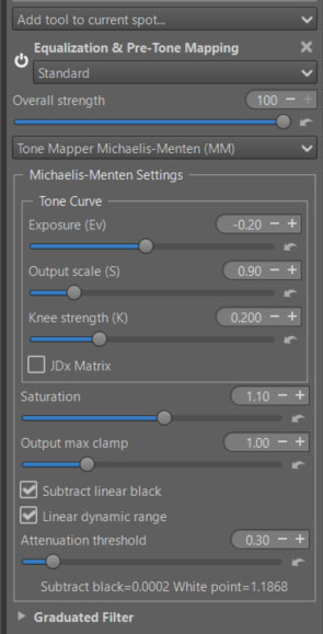
- I used this module (MM) rather than (GHS), not because it’s simpler, but because, unlike GHS, it doesn’t rely on an algorithm to calculate ‘Linear White Point’, and especially ‘Linear Black point’ in this case. When I designed GHS, I assumed that a reduced value of 0.001 was negligible; however, it isn’t here, in this very specific image, and necessitates a manual correction (in negative) of the Black point.
- Note the preferred use of the two ‘hyperbolic’ parameters - Output scale (S) and Knee strength (K). Exposure (Ev) is considered only as an adjustment.
- Note the use of checkboxes (uncheck them all first). Start with
Subtract linear black; you’ll see the histogram compress towards the left, even with the work done beforehand in the Raw section. Then activateLinear dynamic range; the histogram will be compressed by roughly 1.18 (see the values displayed below). The asymptote for highlights will be better defined, and contrast and saturation will increase. - The other settings - which are also important - are part of the chain of mastering gamut and artifacts.
The second - Equalization & Pre-Tone Mapping - Generalized Hyperbolic Stretch (GHS)
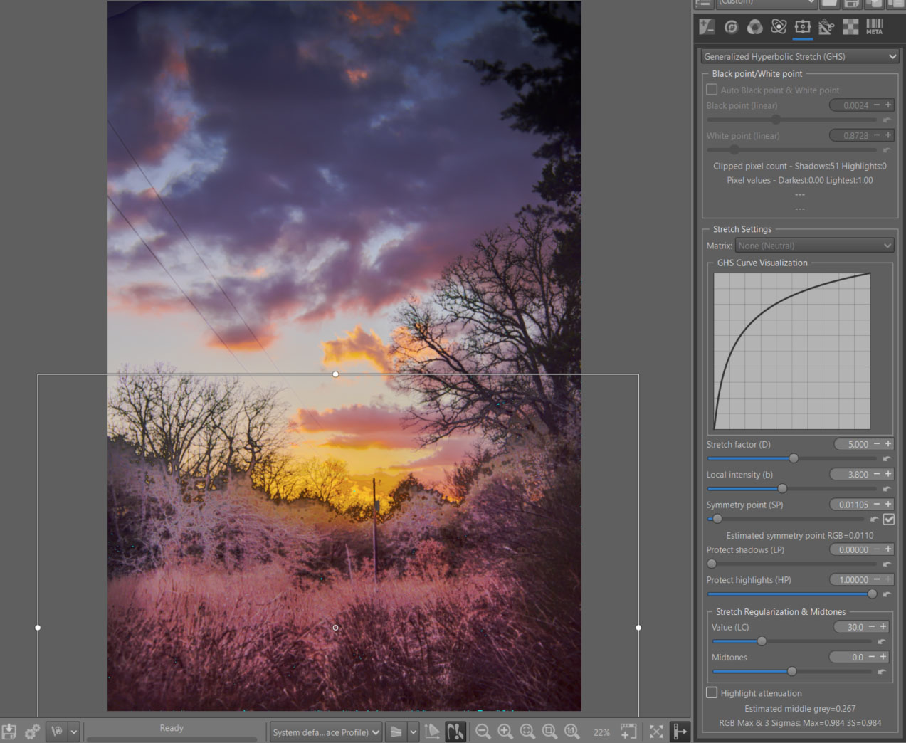
- Choose a Normal RT-Spot ‘Rectangle’, with a small Scope value, so as not to interfere with the sky. Of course, DeltaE and transitions apply; the limits of the RT-spot are of little importance.
- Due to RT issues with the Preview, set the image to ‘fit to screen’, and
enable
Auto Black point & White point. Then disable it. - Activate
Auto Symmetry point (SP). - Adjust
Stretch factor (D)andLocal intensity (b)to achieve the desired effect.
Generalized Hyperbolic Stretch
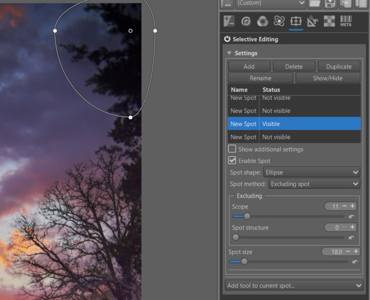
The third - Color & Light - Excluding Spot
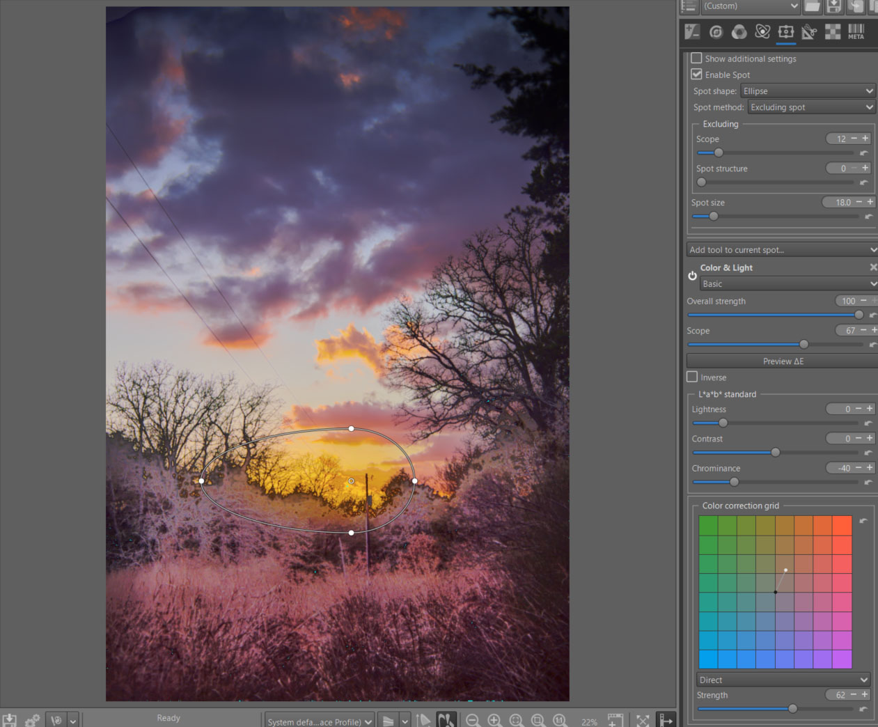
- This Spot Exclusion will undo all changes and allow you to add more. It will remove (at least partially) some of the artifacts and amplify the sky color to make it more dramatic.
- Note the use of ‘Color correction grid’.
The fourth - to reduce artifacts
The fifth - Equalization & Pre-Tone Mapping - Standard - (GHS) increases the dramatic aspect of the sky
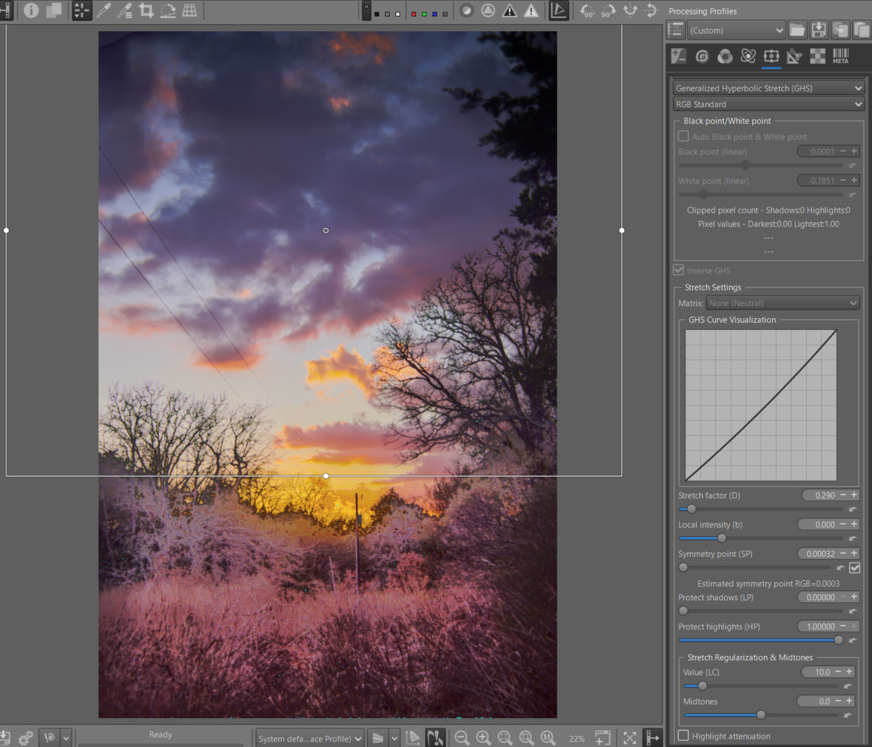
- To enhance the dramatic effect of the sky, I used GHS’s
Inversemode, which allows it to either reverse the image or reduce contrast and highlights. That’s what was done here. - Note the need to switch the complexity mode to ‘Standard’ to have the ‘Inverse’ mode available.
- Activate
Auto Symmetry point (SP). - Adjust
Stretch factor (D)andLocal intensity (b)to achieve the desired effect.
Graduated Filter
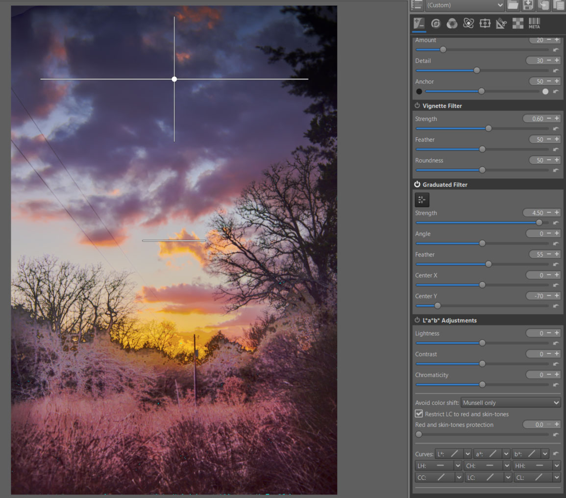
- Nothing new here, I’m using a tool that’s been around in RT for a long time. I could have used the same tool found in Selective Editing associated with each tool, but except for ‘fit to screen’, it’s sensitive to the Preview’s dimensions.
- I positioned it to increase the contrast (more dramatic effect) between the clouds and the rest of the image.
Abstract Profile
I’ll proceed in two steps. First, adjust the tones and check for any
potential excesses in the histogram and gamut. Second, have some fun with
the Primaries & Illuminants module.
TRC Adjust the tones - Contrast Enhancement
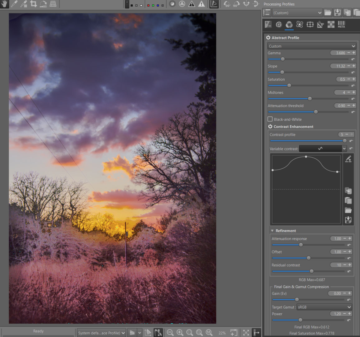
- Note the gamma and slope settings (which is a seamless function) that connect a straight line with a slope value of ‘Slope’ to a parabolic curve with a ‘Gamma’ value. You are manipulating the balance of shadows and highlights.
- The other settings are fairly intuitive. Note the importance of
Attenuation thresholdwhich acts asymptotically on highlights. - For Contrast Enhancement, note the very high value of both Contrast profile (5), which leads to modifying the contrast from 2x2 pixels groups up to 1024x1024 (if the size of your Preview allows it), and the curve which is almost at its maximum. The system uses only wavelets, and only for signal processing. ‘Normally’ as it is designed, it should not (or very little) generate artifacts. The goal here is to make the whole image more dramatic (it is certain that for a portrait, or traditional images, the basic settings are sufficient). Note that the halos are barely visible, even with these unusual settings.
RGB Max - informations
Provides information on out-of-limit RGB values. Values greater than 1 clearly indicate that we are out of gamut whereas for values less than 1, we cannot say whether the image is within gamut or not because it depends, for example, on the luminance. This check is performed at the end of the Abstract Profile and takes into account all parameters. The ‘Attenuation threshold’ slider can be used to limit the RGB values.
Changes made to Color Appearance and Lighting, Final Gain and Gamut Compression are not taken into account.
Final RGB Max & Final Saturation Max - informations
Provides information on out-of-limit RGB values and RGB saturation. Values greater than 1 for ‘Final RGB Max’ and ‘Final Saturation Max’ clearly indicate that we are out of gamut whereas for values less than 1, we cannot say whether the image is within gamut or not because it depends, for example, on the luminance. This check is performed at the end of the processing pipeline and takes into account all parameters. Changes made in Color Appearance & Lighting and in Final Gain & Gamut Compression are taken into account.
Adjusting the Gain (Ev) and Gamut Compression (Target Gamut and Power) settings will allow you to see the impact of these adjustments. You should also observe the histogram, which takes into account the output profile therefore the gamma. This data, which is directly related to the RGB values and Saturation and is in the Working Profile, is in linear mode.
The data is only displayed if Target Gamut is enabled, or if Gain (Ev) is not equal to 0.
Primaries & Illuminants
The objective here is twofold:
- Accentuate the dramatic aspect of the image by strongly increasing the colors in the reds and yellows.
- To show that primaries can also be used in RT (this was initially one of the goals of Abstract profile, to allow color effects).
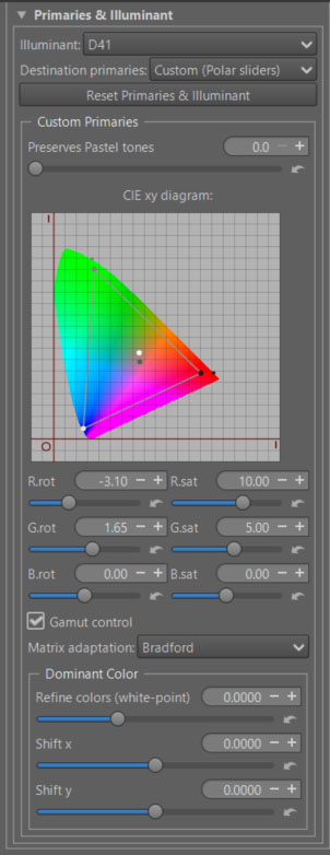
- Note that I used polar coordinates to make this modification of the primaries. I could have done it directly with the CIExy diagram, or in linear mode.
- Note that if instead of increasing the saturation, I had reduced it, we would have gone outside the CIExy diagram, hence the generation of imaginary colors.
- Note that I’ve changed the ‘White point’ of the internal ICC profile to D41. When you change it, you change the dominant color. The primary rotation is done from this ’new’ White point.
- Note that just because a color is in the CIExy diagram does not mean it is in the gamut (there is a 3rd dimension ‘Y’ - equivalent to luminance). But any color that is outside the diagram is necessarily imaginary.
Color Appearance & Lighting
I would like to remind you that this concept is one of the most advanced methods for color management. It is a Color Appearance Model, based on the work of researchers from around the world; its first version (in the form of an Excel spreadsheet) dates back to 1997. Its current name is CIECAM16 (published in 2020). CIECAM
- It takes into account (I’m simplifying drastically):
- The concepts of ‘scene’ (source) and ‘viewing’ (display).
- The separation into 3 processes, with image processing in the middle.
- The shooting conditions (e.g., Absolute luminance), viewing conditions (the image does not look the same in a dark or bright environment…).
- Numerous physiological aspects such as simultaneous contrast, etc.
In this tutorial, I will present it briefly in 2 parts:
- The main settings.
- Those dedicated to modifying each R, G, B channel to finely retouch colors or simulate films.
CIECAM - main settings
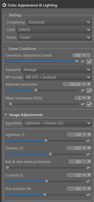
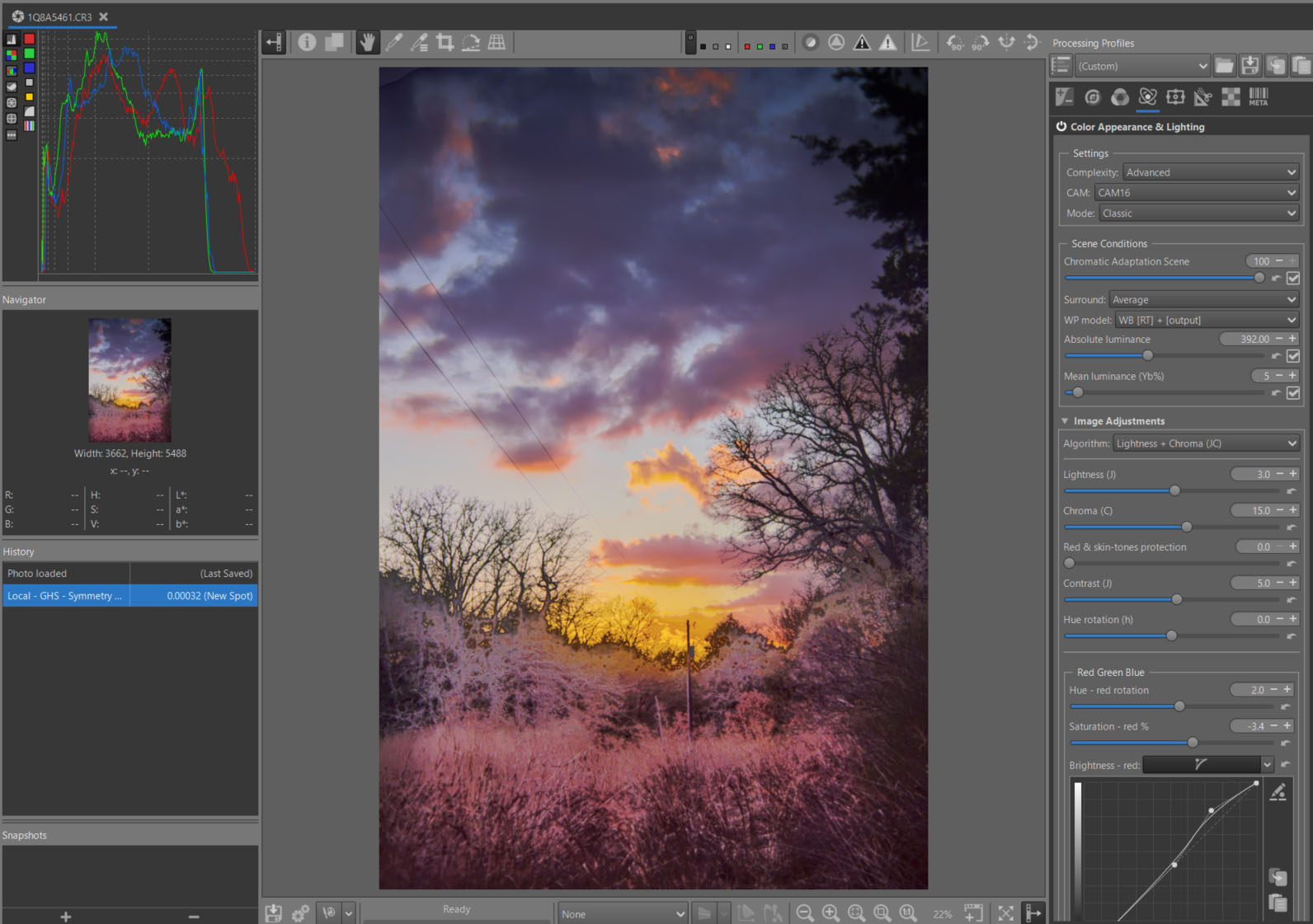
- I chose not to adjust the automatic settings (Chromatic Adaptation Scene, Absolute luminance, Mean Luminance (Yb%), Surround).
- I chose ‘Lightness + Chroma’ and modified the values as shown in the attached image.
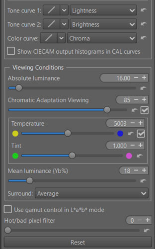
- I chose not to adjust the automatic settings (Chromatic Adaptation Viewing, Absolute luminance, Mean Luminance (Yb%), Surround). But this is where you can (must) adapt the image you see to the Viewing conditions (yours).
- Just try changing ‘Surround’ from ‘Average’ to ‘Dim’.
CIECAM - Red Green Blue
You can modify each R, G, B channel to finely retouch colors or simulate films:
- Rotate each color by degrees.
- Change the saturation (s) in the sense of a CAM (Color Appearance Model).
- Change the brightness (Q) with a curve that allows you to adapt the contrast and brightness to each situation.
As a reminder, in CIECAM there are a total of 9 variables, 6 of which are accessible to the user in RT: Lightness (J), Brightness (Q), Saturation (s), Chroma (C), Colorfulness (M), and Hue rotation (h). They are interdependent. For example Chroma = saturation * saturation * brightness.
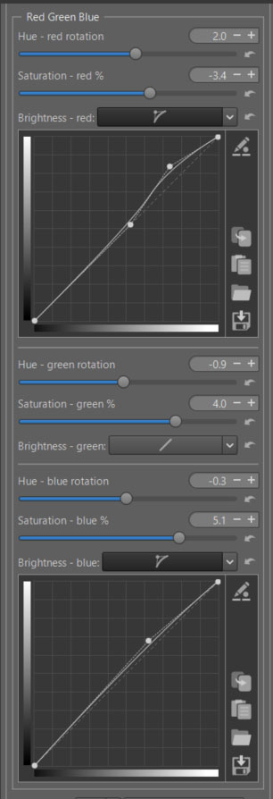
Threshold Brightness Curves
The ‘Threshold Brightness Curves’ aims to limit artifacts due to variations in color differences.
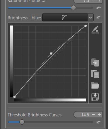
- For this challenging image, I made a point of moderating the settings to avoid artifacts.
Appearance of the result at the end of treatment
- Of course, nothing is perfect, and there remain small artifacts only visible during softproofing.
- I wanted to make the image as dramatic as possible, perhaps even going too far. But let’s remember the objectives; this is first and foremost an educational approach.